Smart Receipts
Team
Smart Receipts


Duration: 11 weeks
Team Members:
Amandeep Singh
Yvonne Liu
Fernando Reyes Jr
Taranjot Samra
Background
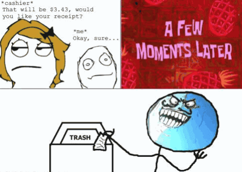
Have you ever walked into a CVS Pharmacy to buy 1 or 2 items and left with a receipt that’s a foot long? You’re one customer, but imagine every customer leaving with a foot-long receipt that they’ll eventually just throw away. As you can imagine, that's a huge waste of paper and trees. In a time where conserving the planet is important, we can't keep using paper for receipts. Therefore we redesigned Smart Receipts, an app meant to receive and store receipts as soon as you make a purchase to help preserve the planet.
Problem Statement
According to CNBC, every year in the US, 10 million trees and 21 billion gallons of water are used to make receipts. Receipts contribute to a lot of the world's waste and in order to help decrease this, individuals concerned for the planet's health are looking for an alternative to paper receipts.
Storyboard
User Research
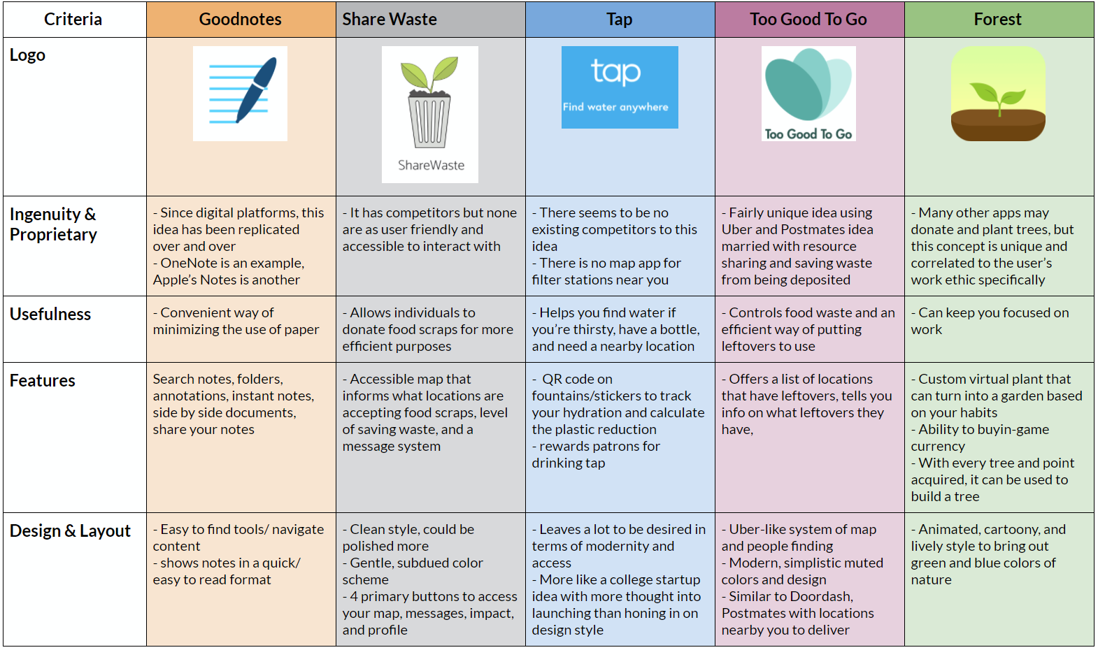
Competitive Analysis
We wanted to take a look at what different businesses/apps were doing to support sustainable development in the world. From our research we found these companies that tackled different sustainability issues in their unique way. We made note of the different features each business has and how they’re helping the environment.
User Interviews
We interviewed 4 people from different backgrounds and ages to get a general idea of how people use receipts and their reasons for keeping receipts. With the responses we got from our user interviews, we were able to group the users into 2 main personas.
Questions asked
- When the cashier asks you if you want your receipt what do you say
- If you get a receipt what do you do with it afterward?
- Do you pay in cash, card, or contactless? Why?
- What contactless payment options do you prefer? Why?
- Where do you typically get the longest receipts from and what do you do with them?
- What medium do you prefer for receiving your receipts? Why?
- How detailed do you prefer receipts when you receive them digitally and how long are detailed physical receipts?
- What are the most important things you look for when you look at receipts? (coupons, giveaways, etc)
- Do you typically prefer getting promotions/coupons? Or do you just throw them away/delete them?
- How often do you lose physical receipts? Where do your physical receipts often end up? (Thrown away accidentally in a bag, ruined in the washer, mistaken for trash, etc)
- How often and where do you typically use contactless payment options?
- What part of the receipt do you never look at?
Personas
Erica

Erica is a 4th year Computer Science student at UC San Diego who is looking for a convenient way to store her receipts. Erica is very extroverted. She goes out with her friends often and makes many purchases at restaurants and grocery stores. Since Erica is the only person in her apartment with a Costco card, she buys groceries for her roommates. The same thing happens when Erica and her friends go to a restaurant. She splits so many things with her roommates and friends that she's lost track of what each person owes her and from where.
The interviews we conducted indicated that users need a way for them to easily store receipts and for there to be a way to split checks easily with others.
Cameron

Cameron is a university researcher at UC San Diego who is looking for a convenient way to store his receipts. Working as a researcher and being a father of 2 means Cameron's mind is always occupied. He often misplaces things and is very forgetful. When Cameron has to return something he purchased, he always has a hard time looking for his receipts. With his old age he is also having trouble being able to read what exactly is on the receipt. Every now and then he is charged for an item twice and can't see it because the text is too small or the item description is unfamiliar.
The interviews we conducted indicated that users need a way for them to easily store receipts and read the contents of the receipt.
The interviews we conducted indicated that users need a way for them to easily store receipts and read the contents of the receipt.
Redesign Process
Style Guide
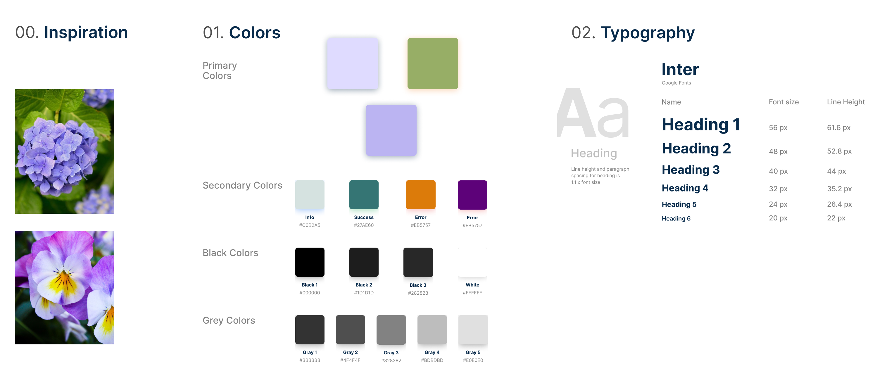
In redesigning Smart Receipt, we felt the color scheme was very dull and needed more vibrant colors. It originally consisted of only black and dark purple. When we were coming up with a color scheme, we wanted to stay true to the original colors. We got our inspiration from nature. As you can see we chose colors that came from flowers and tweaked them a bit so they would stand out from each other while still working well with each other.
Logo Ideation
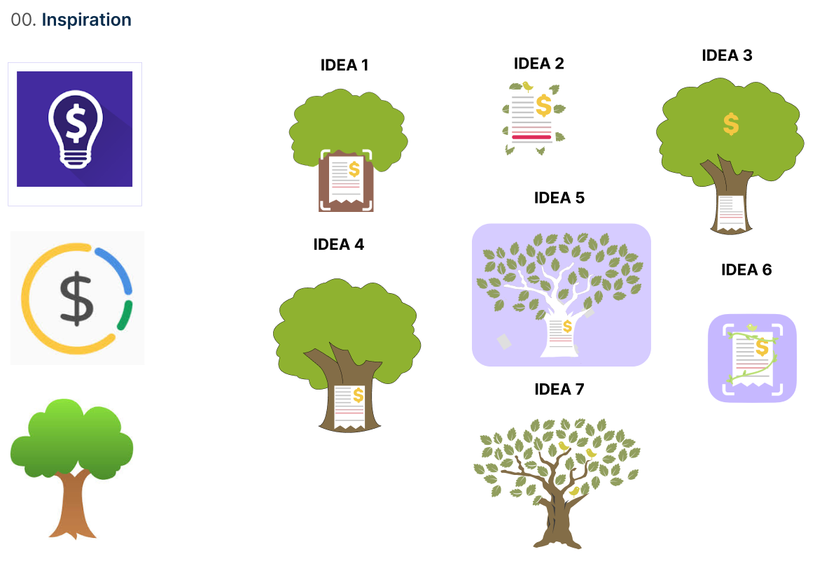

︎︎︎ Since our app dealt with saving trees we wanted to incorporate it into the logo somehow. We ended up going with Idea 6 just because it was cleaner, more professional and didn't have too many things going on. We kept the tree idea by wrapping a receipt with a tree branch.
Hi-Fidelity Prototype
Home

Home Screen 1: The user can see a breakdown of their purchases for the month. We broke up their purchases into four categories

Home Screen 2: When a user clicks on a specific category, the user is able to see a breakdown of their purchases for that category
Scanner

Scanner Screen 1: When a user gets a paper receipt they are able to import it into their library. The user is able change the box to fit the receipt
Scanner Screen 2: When a user scans their paper receipt they are taken to an overview of the receipt. They are able to make any edits the scanning feature gets wrong
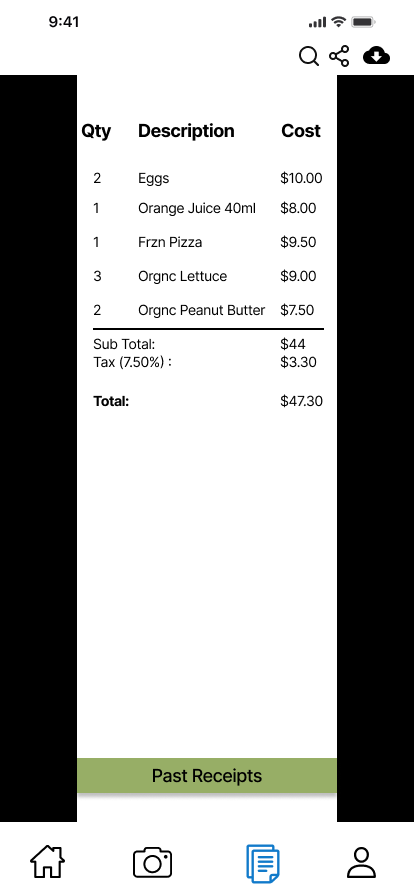
Receipts
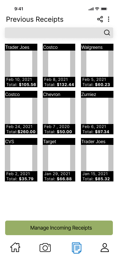
Receipts Screen 1: This is a library of the users past receipts. They are able to search for specific places to find the one they need quickly and easily. It is also color coded to make finding things easier

Receipts Screen 2: This is an overview of the receipt that a user taps on. They are able to export it in different mediums. They are also able to see the specifics of a receipt in the description.
Profile
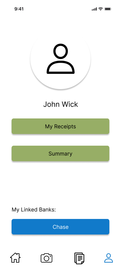
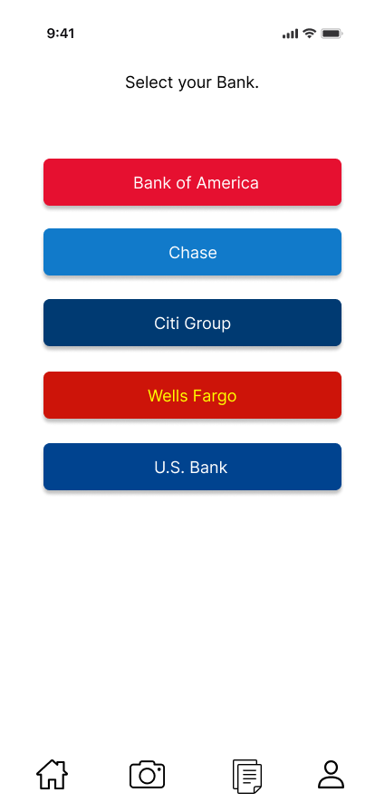
Profile Screens: The user is able to add multiple cards from various major banks. They can also see a summary of their spending habits.
Changes Made From User Tests
Before
![]()

After
![]()

The image on the left was our first iteration of what it looked like to receive a receipt from a store. We changed them to match present conventions. Our first iteration didn't look professional enough and wanted the industry standards of pop-ups to make a cleaner design. We also felt like the "check" and "x" button would cause users to be confused on it's meaning.
Before
![]()

After
![]()
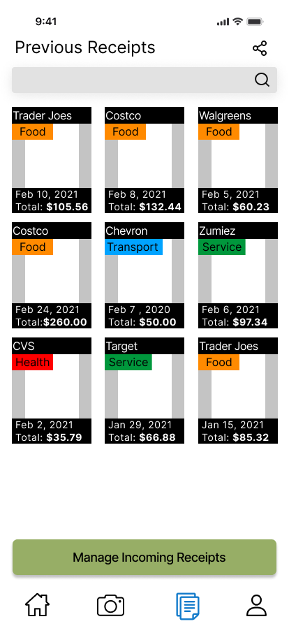
The image on the left was our first iteration of what the Previous Receipts page looked like. In our user testing, we found that users spent a while looking for a specific receipt. We have a search function to make it easier for users to find a specific type of receipt, however users didnt try using it. We added color that matches a recipts categorie to make finidng receipts easier.
Before
![]()

After
![]()

Users in our interviews mentioned how some of the text in various pages were too close together making it hard to read. Therefore we added more spacing and increased the font size to make it more readable.
Reflection
This project taught me a lot about redesigning and extending app features. At the time of the redesign, the Smart Receipts app was in its very early stages and didn’t have many app features or a style guideline. I hadn’t heard of style guidelines before, so revamping the logo, color scheme, and style guideline was one of the best parts of this project. I had a great experience being able to reimagine how Smart Receipts looks.