Cut & Dry Barbershop

Duration: 10 weeks
Team Members:
Fernando Reyes Jr - UX Researcher
Julie Han - UX Designer
Thuy-an Hoang - Visual Designer
Khiem Pham - Web Builder
Lillian Wei - Marketing + Content Strategeist
Background
Cut & Dry Barbershop is an Asian-American, veteran-owned, and operated barbershop located in Mira Mesa, San Diego. Cut & Dry serves as a vision of a community for their customers from all walks of life, beginning as a husband-wife duo in 2016. We were gravitated towards working with this small business because many of us were able to identify with them as minorities, but, even more so, all of us knew the hustle of working hard as a POC in America. That is the reason why we chose to participate in Power Up this summer. The theme of this program to support BIPOC minority-owned businesses is very important and personal to each member of our team. We understand the adversities these communities may face in order to succeed, and on top of that, we saw how the COVID-19 pandemic had negatively affected small businesses. Thus, our team wanted to utilize what we had in order to support and uplift these businesses in any way that we can, including design and marketing.
Problem
Once COVID-19 hit, many businesses were forced to shift more towards establishing an online presence to promote themselves. With having to work both the barbershop and manage their online platforms, Cut and Dry has struggled with defining and communicating their voice and identity online to potential clients.
Cut and Dry Barbershop has been experiencing a disconnect with their online community, and as a result, believe that it’s been difficult to find both clients who are aware of their culture and values. How might we help establish a deeper and more personalized connection between online visitors and the business in order to increase engagement and booking activity?
Solution
Our initial research on Cut and Dry’s current online presence showed us that Cut and Dry lacked cohesive branding on both their main social media platform, Instagram, and their website. As a result, it made it difficult for users to immediately understand Cut and Dry’s individuality and services.
We revamped Cut and Dry’s online presence by establishing and implementing a visual system that will guide and support cohesive and welcoming branding on their Instagram and Website. We also redesigned their website while focusing on crafting and communicating their origin story and brand personality, and optimizing navigation, flow, and organization of information.
User Research
Competitive Analysis
I wanted to take a look at the different businesses that Cut & Dry is competing with and to see what industry-standard features are present on barbershop websites. I looked at different types of barbershops such as corporate, local, and popular barbershops. I made note of the common features on the website and analyzed how effective they were.

Survey
We sent out a mass survey to Cut and Dry’s current clients, and the greater barbershop community across social media pages, to uncover the needs and goals of individuals who visit or are likely to visit barbershops. Our goal was to find out general history about barbershop discovery and experience and to gather thoughts and impressions on their current social media.
Some Questions asked
- What users look for when looking up a barbershop (to organize information)
- What attracts them to a certain barbershop (to influence marketing strategy)
- What they feel about the current appearance and content (to evoke emotions)
︎Key Insights
- The top five things users want to see on a barbershop website are price, reviews, pictures of previous work, location, and the business culture/background.
- Users felt that the color scheme and photos present on the website and social media were a little boring and they can’t tell it’s a barbershop at first
- Users wanted to see a variety of content on the website and social media such as videos, barber highlights, and community work.
Website Critique
I conducted an internal critique on Cut and Dry’s current website and sought to validate and invalidate our critiques with the help of a participatory critique session with users.
︎ Key Insights
- The website lacks a hierarchy of information making it difficult for users to distinguish different types of information.
“It was hard to spot. It's the same color as the section before it.”
“It was hard to find things on the website”
2. There wasn't solid branding on the site. Users had a vague understanding of the business’s background and culture.
“I can't really say what kind of vibe they give off”
"I couldn't tell by the first screen that it was a barbershop”
3. The layout of information and button interactions left users feeling confused.
“Usually there’s a section with the business hours or on the very bottom where the contact information is.”
User Testing/Interviews
I conducted several rounds of user tests and interviews over Zoom with 12 unique participants ranging from all ages. The purpose of the interviews was to give the User Designer feedback on the layout.
Affinity Diagram
In order to organize the data we compiled throughout the survey, interview, and website critique results, we created an affinity diagram. Breaking down pain-points and observations led us to discover these distinct insights:

︎ Key Insights
- An unclear backstory led users to view them as impersonal.
- They lacked cohesive branding which led to an inconsistent perception of the business
- There isn’t enough visual content to spark interest in the business or help users decide on a haircut or barber.
- Inconsistent information architecture and information made it difficult for users to navigate the site
Lo-Fidelity Prototype & Testing
🏁️ Our Goal
In this first round of user testing, we wanted to test the organization of information as well as page content and layout.
︎ Key Insights from A/B Test
Barbers Page
![]()

︎
Users disliked Barber Page A because of the landscape images.
︎ Users felt like it didn't make sense to have the image type be landscape. However, due to the whitespace on the right side, users expected it to be filled with information about each barber.
︎ Users said it made more sense to have a portrait image accompanied with the barber information.
︎ Users were unsure where the barber information would be located on Barber Page B. Users felt like there was already a lot going on in the page without the text.
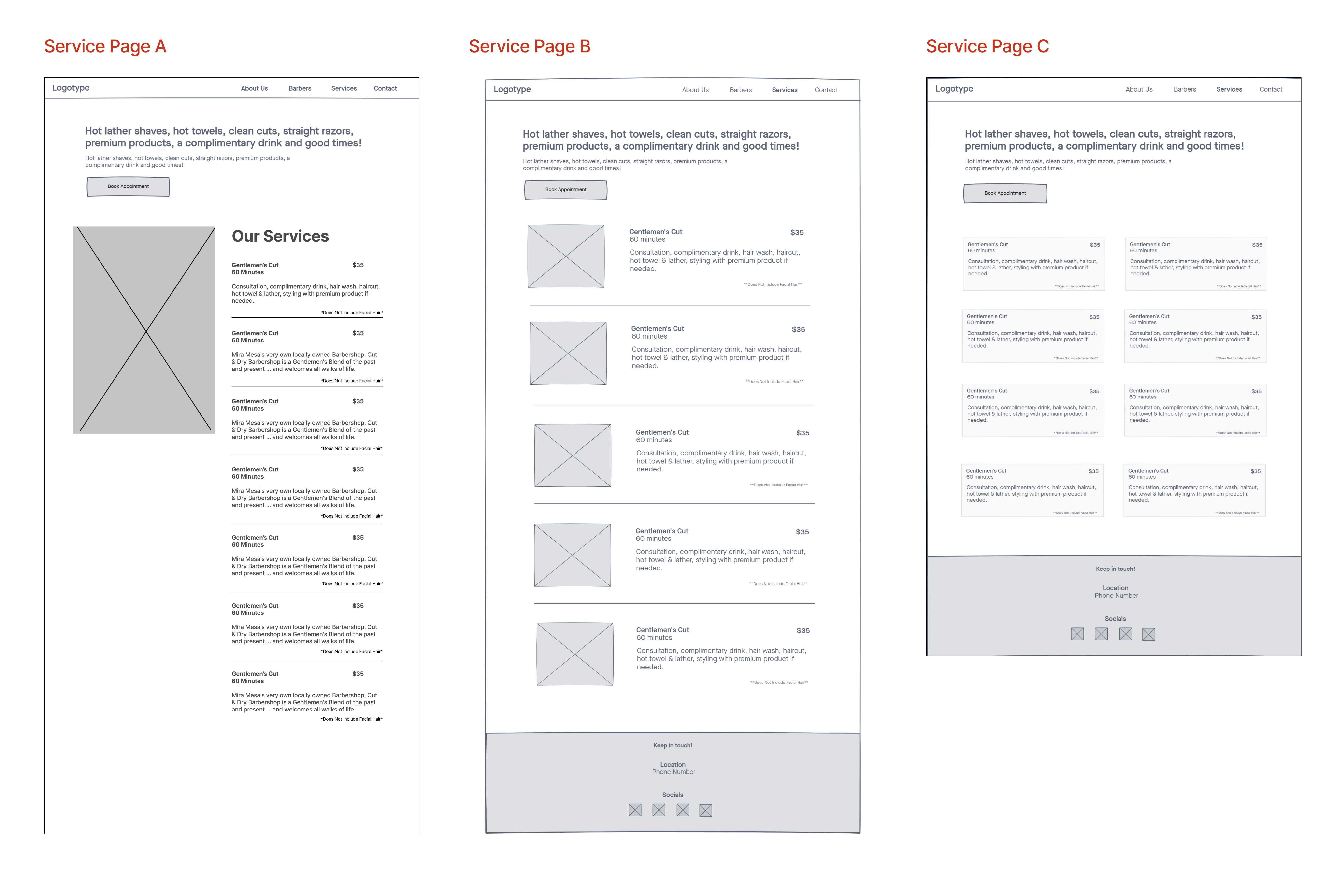
Service Page
︎
Users generally liked Service Page B the most. They thought the layout and information presented made sense. It was easy to read through quickly.
Pop out Designs

︎
Users didn't feel like a popout for the services section was necessary. A lot of the information was already on the services page and users felt like it was redundant information. They felt like the information should already be on the services page and didn't want to have to spend more effort going through each service’s popout.
Mid-Fidelity Prototype & Testing
🏁️ Our Goal
We increased the fidelity of our prototype by beginning to incorporate our visual system into the prototype. During this round of user testing, we continued to push for commentary on the layout in determining the extent of storytelling for the About Page, and ease of finding what users are looking for.
︎ Key Insights from A/B Test
Barbers Page
![]()

︎
Users felt like Barber Page B had the most familiar layout because they’ve seen the layout on IG. However they mentioned that if there were to be text included, the page would look so crowded and be hard to read.
︎ Users also didn't like the idea of having a popout for the Barber Page because they didn't want to have to do more work and the information should just be presented on the page for the user to easily see.
︎ Users also didn't like the idea of having a popout for the Barber Page because they didn't want to have to do more work and the information should just be presented on the page for the user to easily see.
Service Page

︎
Users didn't really understand why there would be a popout with the same information if they only wanted to see more images from a specific service.
︎ Having the icons in the popout confused users. Users didn't see why it was there. They felt the description was enough for them and didn't need the icons.
︎ Having the icons in the popout confused users. Users didn't see why it was there. They felt the description was enough for them and didn't need the icons.
Hi-Fidelity Prototype & Testing
🏁️ Our Goal
Based on feedback from iterative user testing, we created the high-fidelity prototype to continue seeking feedback on visual elements such as layout, color balance, and interactive elements.
︎ Key Insights from User Test
Home Page
![]()
![]()


︎Users appreciated how the layout of information allowed information to be easily digestible.
︎Users thought Cut & Dry's Spotify song was of secondary importance compared to the business "Hours" section.
︎Users felt that the “Hours” section should be emphasized with a higher placement due to being primary information that users often seek.
About Us Page


︎
Users felt that the new layout helped emphasize a smooth storytelling aspect, with the “Community” section now part of their story.
︎ Users could not identify who the business owner was.
︎ Users thought the video disrupted the flow of Cut & Dry's story.
︎ Users thought the tinted images were misleading since they were unclickable.
︎ Users could not identify who the business owner was.
︎ Users thought the video disrupted the flow of Cut & Dry's story.
︎ Users thought the tinted images were misleading since they were unclickable.
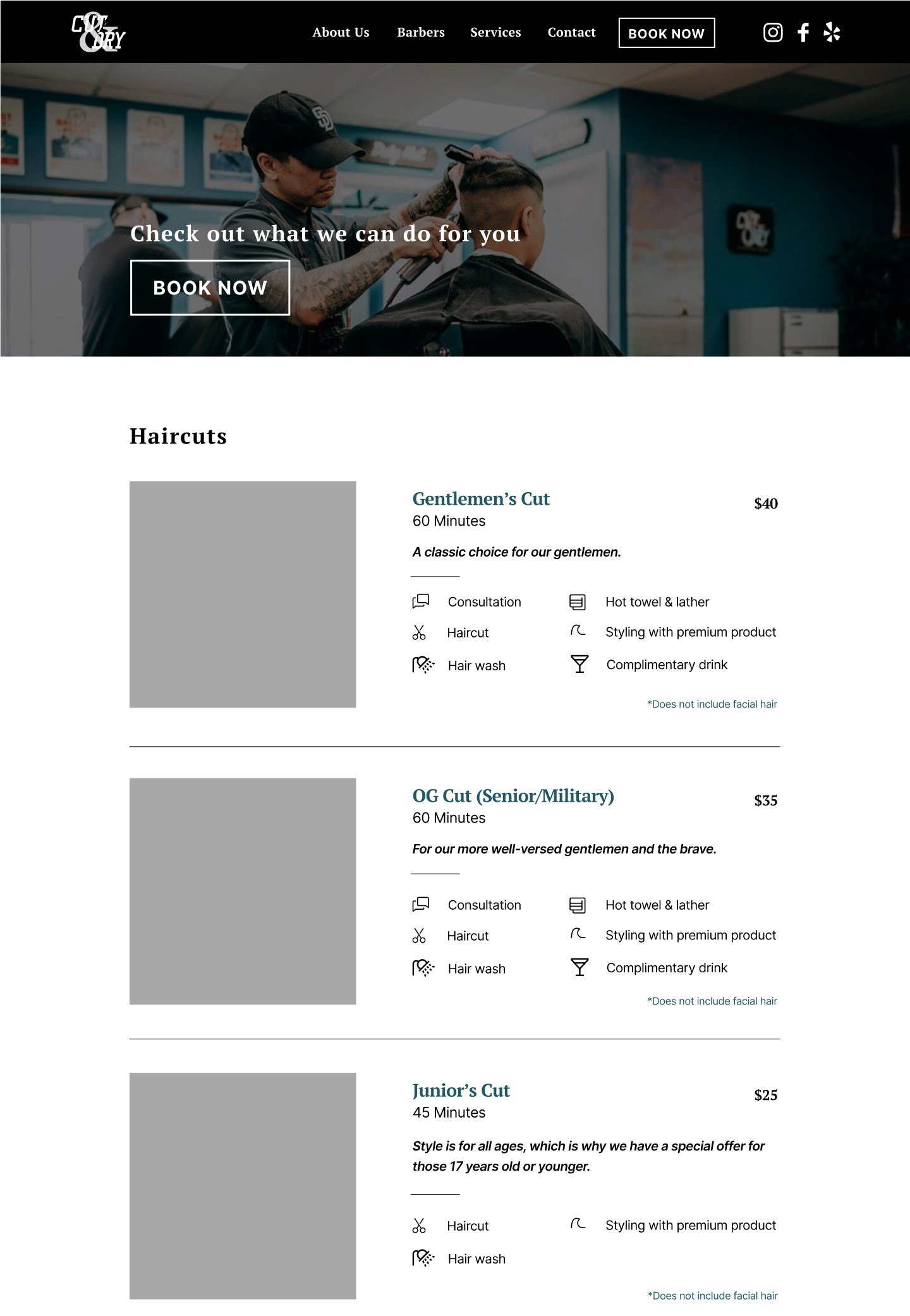
Services Page
︎
Users found ease in being able to distinguish between the services with icons that represent each item that comes with a service.
Reflection/Challenge
This opportunity to work with Cut & Dry really helped me learn a lot about the tasks and responsibilities that a User Researcher has. In previous projects that I have been a part of, the group didn't have assigned roles. We all worked on each part of the project together. Cut & Dry was the first project where we had assigned roles. At first, I was a little lost and didn't know what tasks fell under my role or where to start. However, having asked for advice from mentors, I quickly set out to do my tasks. Overall, I had a great experience working with my teammates and mentors and feel like we came out with a good product.