Team Fresco
Fresh Or Fishy

Duration: 11 weeks
Team Members:
Amy Hogan
Carolina Vega
Fernando Reyes Jr
Background
Imagine you get home after a long day. You cook yourself the salmon you had been saving. You sit down ready to eat and skim through Netflix to watch something as you eat. You see a new Netflix documentary that talks about fish and the fishing industry and decide to put it on. In the documentary, they describe illegal fishing practices being conducted and the negative outcomes it has on the environment and sea life. Having finished the documentary you go through your fridge to check the package your fish came in. You don’t know what the labels mean or how to check if the fish were sustainably caught.
Client's Objectives
The team compiled a list of questions aimed at understanding the business and the client’s objectives and expectations. We compiled this list from the information gathered during our meeting with the client and ranked it by importance.
-
Friendly, simple, inclusive, and educational website
- Solidify a branding for Fresh or Fishy (make a logo and style guideline)
- Not include anything that says the words illegal or blockchain
- Look legitimate and trustworthy
-
Create a one stop site for people interested in learning about fish sustainability
-
Show users sustainable yet affordable fish options near them
- “About Us” section explaining Fresh or Fishy’s values
-
Scrollable diagram of the seafood supply chain
- Possible mapping feature
- Have a section for suppliers only
- Wants a FAQ
- Blog feature with alerts for subscribers/followers
- A section for social media
Fresh or Fishy’s main objective is to be educational, inclusive, and inviting. Therefore, the design must be user-friendly, clear and concise. At the time of writing this, Fresh or Fishy does not have a website. They also do not have a logo, style guideline, or content. The goal of the project was to create a logo, style guideline, and a mobile and desktop website.
User Research
User Interviews
We interviewed 12 people from different backgrounds and ages to get a general idea of people's relationship with fish, their general knowledge of the fishing industry, and how users choose which fish to get. With this, we were able to create three different personas with user scenarios & use cases.
Personas
Persona 1 - Dimitri
![]()
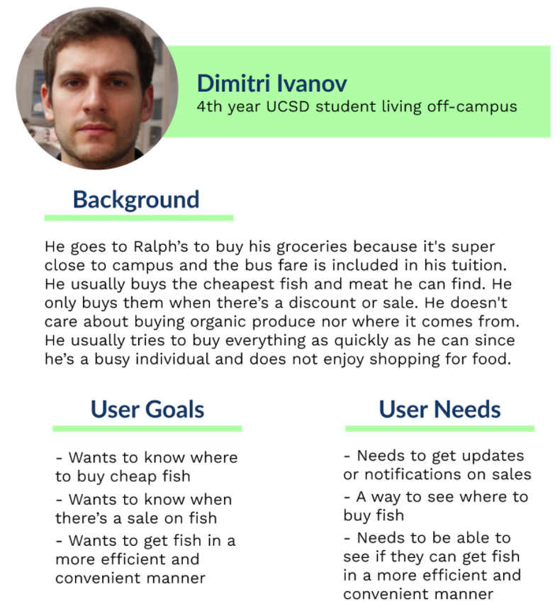
These users don’t have the budget to spend more on better quality, sustainable fish, so their goal is to find the most affordable fish they can get when they buy fish or eat out at restaurants. This means that college students are likely buying unsustainable and/or illegal fish. Since Fresh or Fishy wants to be inclusive with their user base, we want to show ways that college students can be sustainable in an affordable way. We will do this by implementing a price gauge feature to our fish finder search feature.
Scenario #1
Dimitri just received his SNAP benefits and needs to go grocery shopping. Dimitri relies mostly on his SNAP benefits to cover his food expenses but it’s not much so he’s kind of on a budget. Dimitri really enjoys fish and wrote it on his grocery list but, he would like to know where the cheapest option is before he goes out to buy.
︎
Use Cases
- View if certain types of fish are on sale.
- View which markets accept SNAP benefits.
- Compare the prices of fish in each market.
- View all the stores nearby that sell fish.
- View different customer testimonials.
Scenario #2
Dimitri is trying out a new sushi recipe that is supposed to be quick and easy. The recipe includes salmon, which tends to be a more expensive fish. Besides knowing where he can buy cheap salmon, Dimitri would like to know which fish makes a good, cheap replacement for his recipe.
︎
Use Cases
- Learn more about the types of fish available.
- View if certain types of fish are on sale.
- Compare the prices of fish in each market.
- View different customer testimonials.
- View what kinds of dishes he could make with the new fishes
Persona 2 - Fatima
![]()

These users care about the quality of the fish they are buying for their family and are willing to spend more for better quality fish. Fresh or Fishy’s goal is to educate these users about the difference between sustainable fishing and good quality fish because there is a big misconception that these concepts are the same thing. These users often look for restaurants and grocery stores that have good quality fish, so we want to incorporate a search feature similar to that of Yelp, to find restaurants and grocery stores that carry sustainable fish. This will be a simple way for parents to practice supporting sustainability within the fishing industry.
Scenario #1
Fatima’s family went on a camping trip on which they went fishing for the first time. The trip made her and her children reflect on the fish they eat and they would like to know more about where their fish comes from and how it is caught.
︎
Use Cases
- Get more information on what it means for fish to be sustainably caught.
-
Confirm the legitimacy of the website.
-
View different customer testimonials.
- Learn how she can support sustainably caught fish.
- View markets in her area that have organic and sustainably caught fish.
Scenario #2
Fatima is used to going to the same market all the time to get her organic and sustainably caught fish. The current one she goes to only has a few selections. She’s gotten so tired of getting the same fish and wants to try new ones that are still organic and sustainably caught.
︎
Use Cases
- Confirm the legitimacy of the website.
- View markets in her area with organic and sustainably caught fish.
- View the different types of fish each market has.
- Compare the prices of fish in each market.
- View what kinds of dishes she could make with the new fishes.
Persona 3 - John
![]()
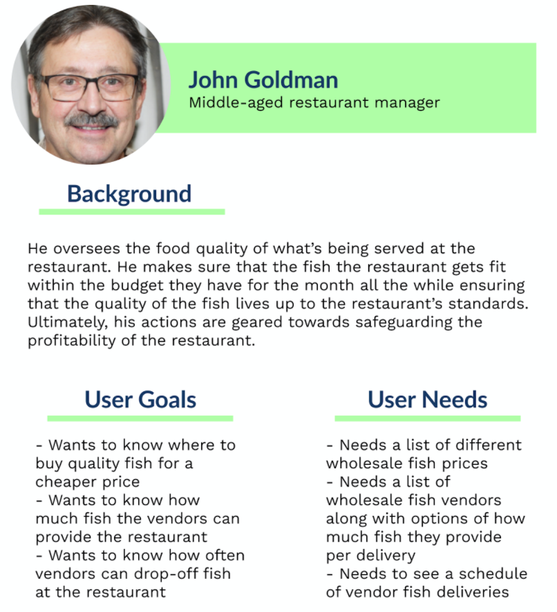
This audience group focuses on restaurants that serve fish. Users in this group are looking for the best quality fish for a cheap price. Buying sustainably caught fish can mean an increase in price and a decrease in profits. With search features, we can help businesses look at cheap locally caught sustainable fish as a viable option and make it easier for restaurants to switch.
Scenario #1
John’s usual fish vendor is raising his prices and they are no longer within budget. John must now find a new vendor that fits the budget without sacrificing the quality standards of the restaurant.
︎
Use Cases
- View the different vendors in the area.
- View the different types of fish each supplier is selling.
- Compare the prices of fish that each supplier sells.
- View if certain types of fish are on sale.
- Confirm the legitimacy of the website.
Scenario #2
John’s business has not been gaining any new customers. He’s been looking into making the restaurant be more environmentally friendly to gain a newer younger audience into coming into his store. His restaurant has a lot of fish dishes and would like to get sustainable fish from suppliers.
︎
Use Cases
- Get more information on what it means for fish to be sustainably caught.
- Confirm the legitimacy of the website.
- View which suppliers provide sustainable fish.
- Compare the prices of fish that each supplier sells.
- View the different types of fish each supplier is selling.
Audience’s Objectives
- Learn about fish sustainability easily - A main reason for the target audience to use our website is to be educated on what sustainable fishing is and how to support it. Not only that but they are looking to learn about it in a manner that is inclusive, easy to understand, and interactive. The target audience will hope to have the information be broken down into easily digestible sections.
- Check the different labels a restaurant/store has - Another major component for our target audience is to be able to find out the different fish labels a restaurant/store carries. Using Fresh and Fishy’s search feature will allow the user to see the different labels easily and quickly.
- Where to get legal fish - Aside from being able to check the different labels a store carries, our target audience wants to be able to find the stores/restaurants that have legally caught fish. The user is able to see how much of their much is legally caught and where those stores are located.
Problem Statement
Although many fish consumers that care about sustainability are willing to pay more for better quality seafood, they need a more inclusive and trustworthy source that provides information on where to find more affordable and sustainable seafood options.
Competitive Analysis
For our competitive analysis we looked at: Monterey Bay Aquarium Seafood Watch, Fishcoin Project, Tasteatlas, Barn2Door, American Seafoods. Although some weren’t direct competitors to Fresh or Fishy, their sites included several features regarding navigation and content we wanted for our design.
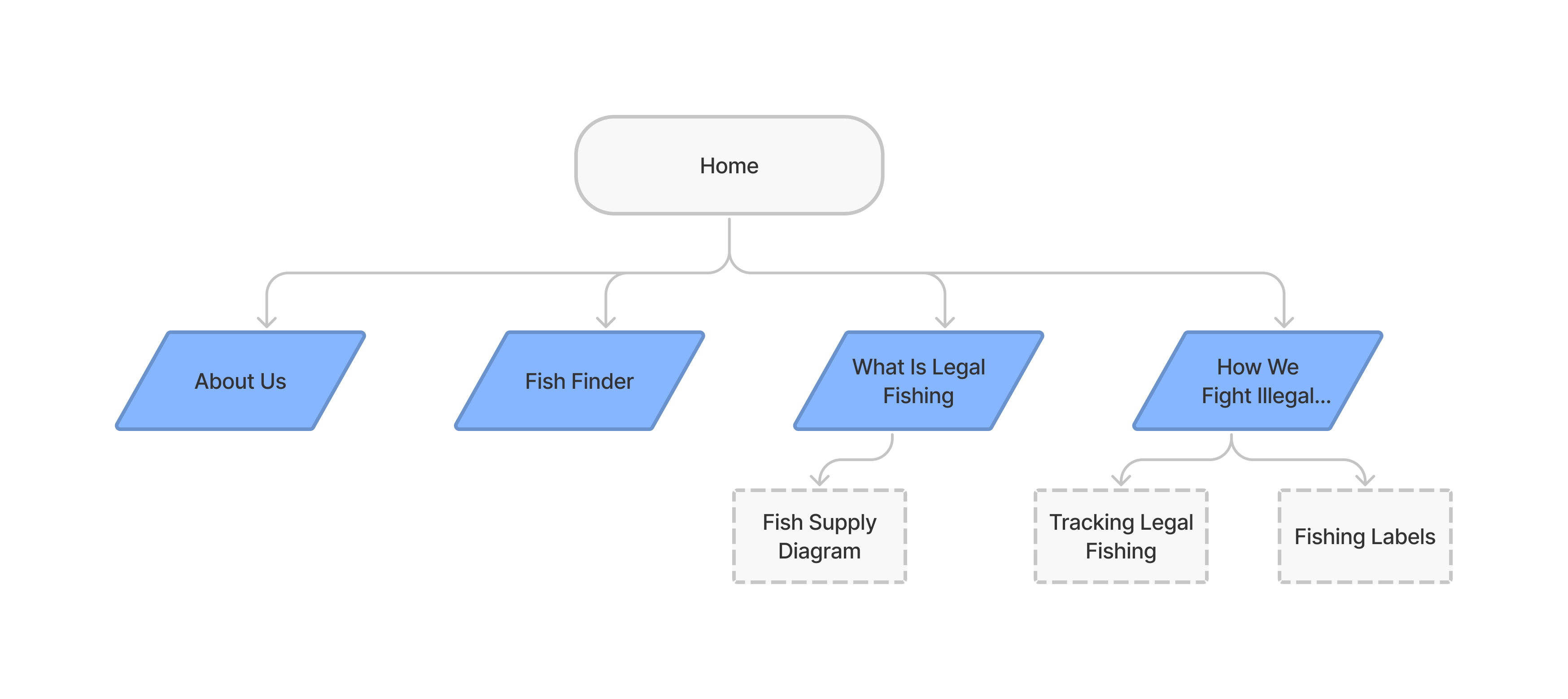
User Flow
Hi-Fidelity Prototype
Home
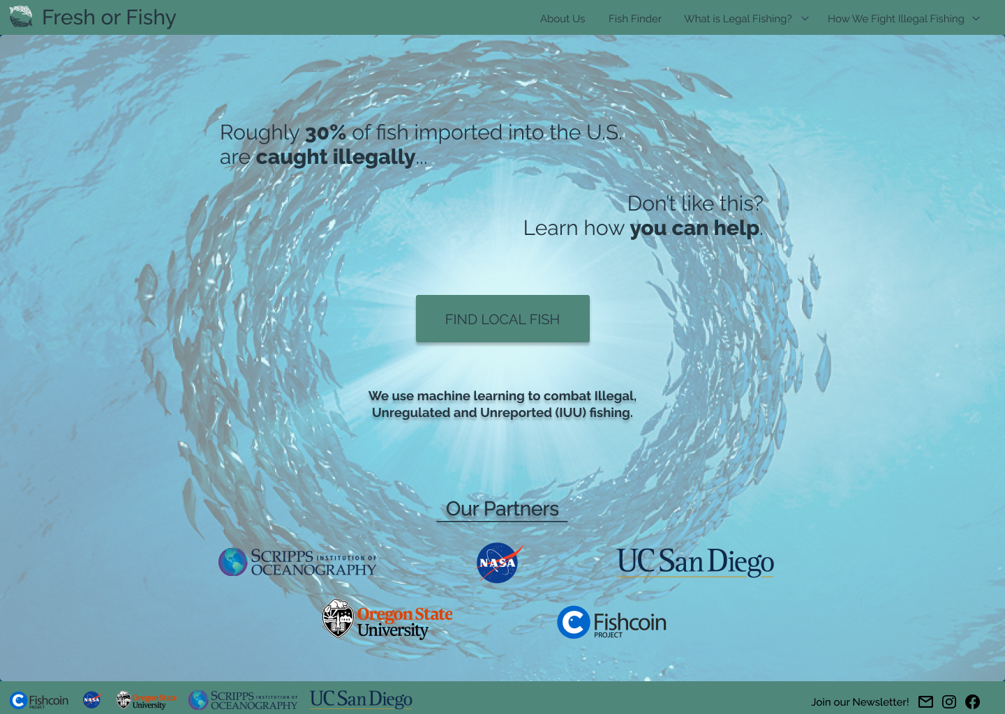
Making new users who stumble upon our site become passionate about seafood and sustainable fishing was something that our team worked on heavily to ensure repeated visits to our site. The inspiration for the homepage came from the feeling kids had when they first visited an aquarium. We really wanted to humanize fish and give the viewer a sense of awe. We also put a statistic about just how much illegally caught fish make its way to local markets. 30% is a lot and we wanted to have that at the forefront of the site to show people that it is a problem. We also tried to highlight reputable partners to help make our website more trustworthy.
What is Legal Fishing?
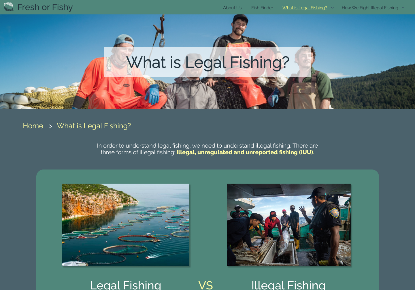
The “What is Legal Fishing” page emphasizes the importance of supporting legal fishing by explaining illegal fishing practices in comparison to legal fishing practices. We felt comparing legal and illegal fishing would be the best approach to explaining legal fishing in an easy and digestible way for users.
Fish Supply Diagram
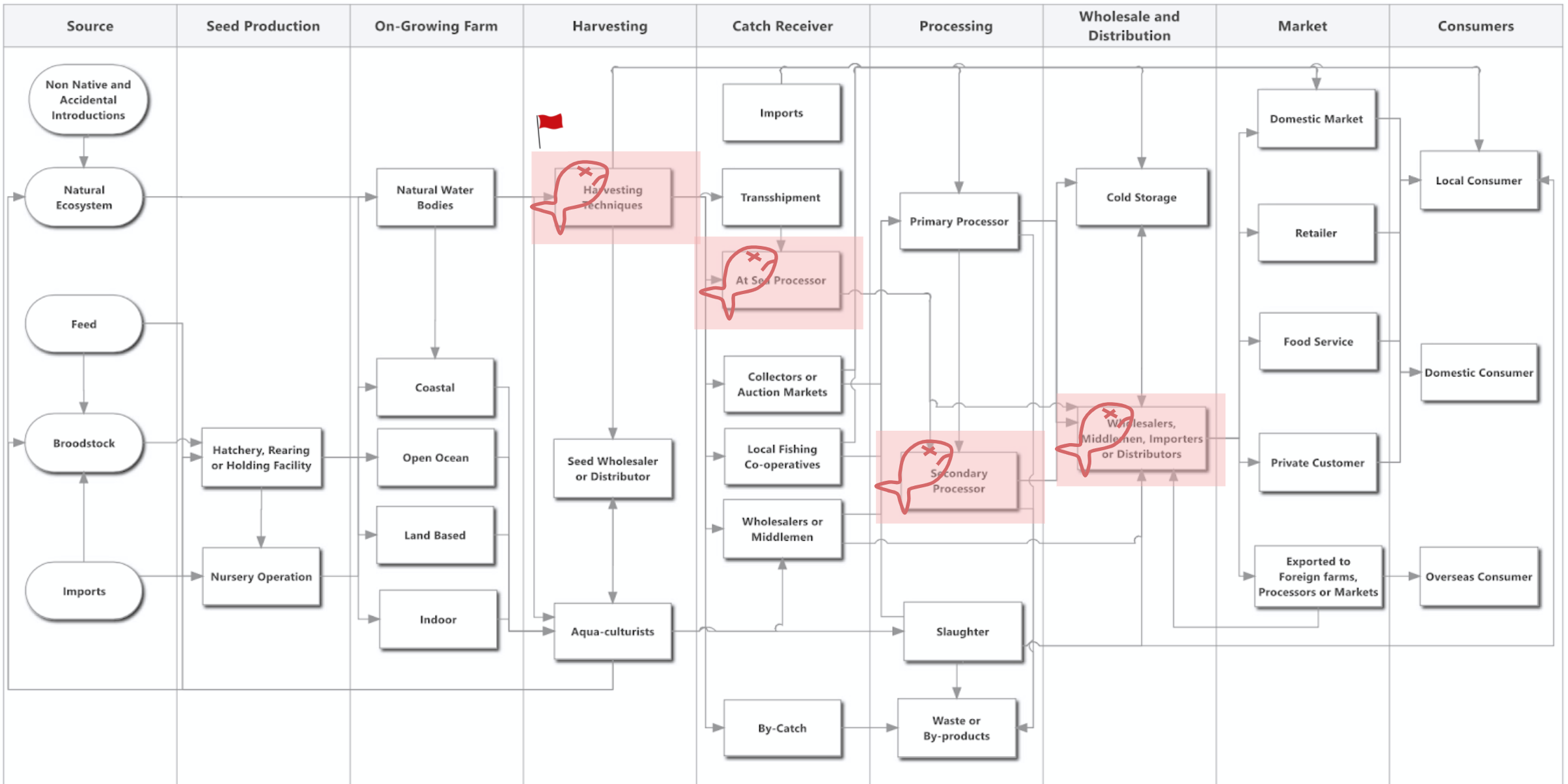
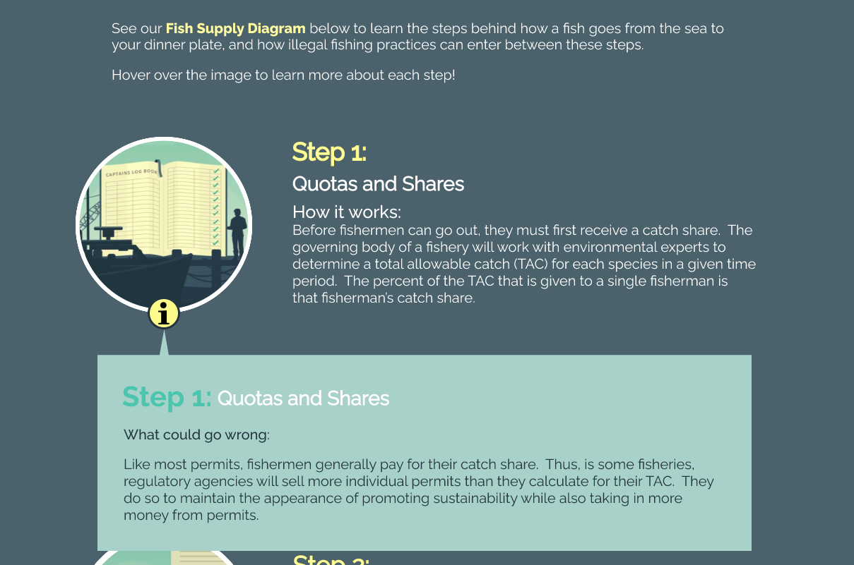
The most information-heavy and complex part of the website has to be the Fish Supply Diagram. The whole fishing supply chain is extremely complex and has many different components playing a role. The image below shows a simplified version of the fish supply chain that our client had worked on.
As you can see there are many pieces that play a role in getting fish from the sea to markets. Our team had to simplify the fish supply chain further in order to give users an easy-to-read experience that wasn't overwhelming.
We simplified the supply chain to 6 steps that explain how fish go from the sea to markets. Having done that we also wanted to show how illegally caught fish were able to enter the supply chain in each step. In order to have the site be more interactable and make users curious to learn more information, we had this section located in the "information" icon. With this approach, we were able to add more information without overwhelming the user and making each section easily digestible.
Fish Finder

Using the Fish Finder users can easily search for shops, restaurants, and markets in their area that carry legal fish for whatever price range they're looking for. They can also sea the types of fish each market carries
Changes Made From User Test

We have the "plus" sign on the first image as a call to action for users to tap on in order to interact with the app. Many of the users during our user test didn't even notice that you could interact with the "+" sign, they just thought it was part of the graphic. As a result, we had to change the icon we used and changed the color to help it stand out more. We felt the "i" icon would be a better call to action since its a convention people often see that is interactable and show more information
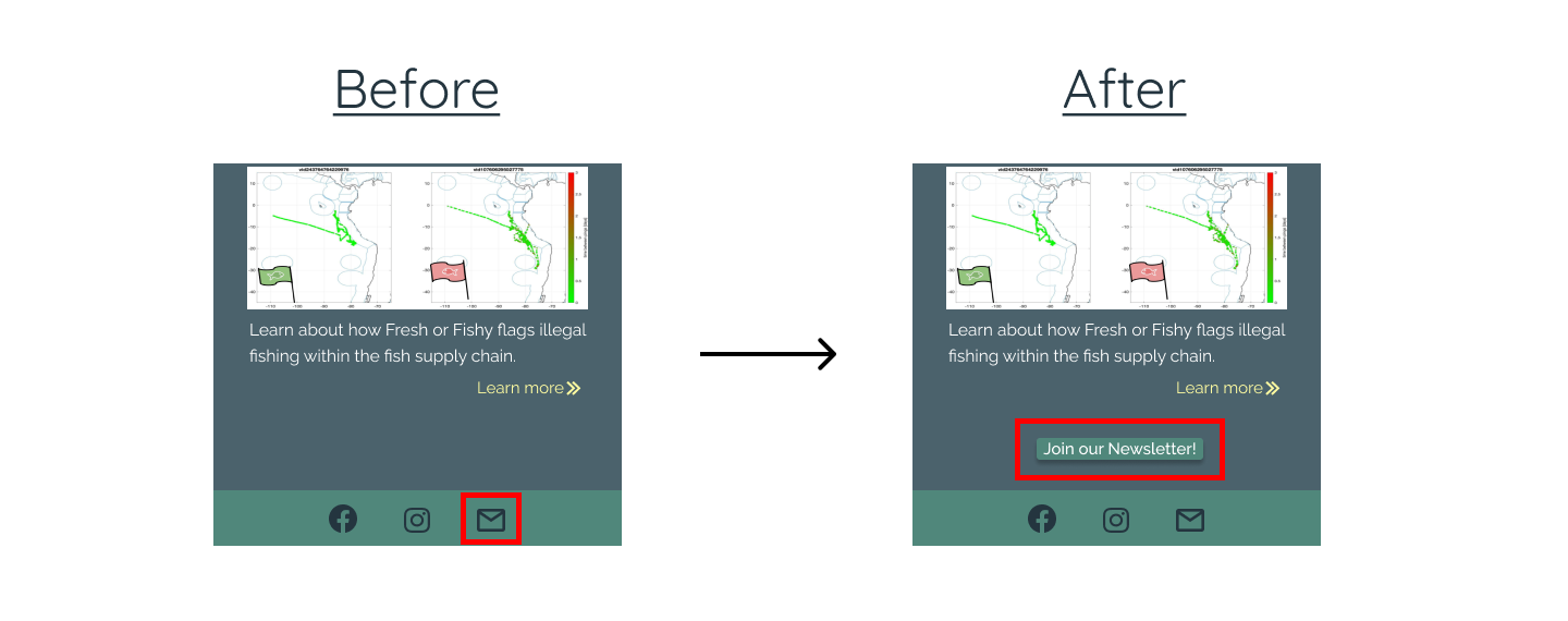
Another thing we changed that was a major pain point in our user tests was the mail icon. The client wanted a newsletter and a contact us button. We didn't realize that users would get confused with the mail icon therefore we made the newsletter button more apparent so as to not confused users.
Challenges faced
One of the hardest parts of the project was turning our client’s project into a brand. Fresh or Fishy is a graduate project developed by our Teaching Assistant Sam and his group. There is currently no website or app for the "Fresh or Fishy" project. Our client’s graduate project focused on making a method for finding and flagging fishermen who were conducting illegal fishing practices. Because of this, at first, we had a lot of trouble designing the layout of the website that would fit both the user’s and client’s needs. Our team's job was to make a mockup of what their site would look.
We also had to create a logo, branding, and color scheme because our client had not intended to make the project into a real-life fishing label at the time. We had to use a placeholder logo we had until our client found a design he liked.
Another issue we ran into was not having enough content for the website since there is currently no existing website. And, though we are trying to be as inclusive as possible, branding might be somewhat difficult because not many people are passionate about fish.
The fish finder was another aspect of the website that was hard to make because there was so much interactivity. Because creating an interaction for each filter and each checkbox would require a separate frame, we limited the interaction to showcase the usability for our user scenario. We were able to figure out the interactions for the Fish Finder on the desktop site, but given how we wanted to showcase the filter selections on the mobile site, we were not able to make the interactions smooth for the mobile Fish Finder.

